
This weeks lecture pod was based on utilising design patterns. As technology expands and mobile phones are now becoming more prominent over computers and Ipads, designs firs begin made according to mobile phone sizes. Then they work their way up expanding in physical size to fit a desktop surface area. This allows us to prioritise due to the small screen we have to work with. Since this movement within the design world, different and efficient design patterns were created, these include:
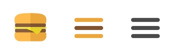
- The Hamburger menu – A button consisting of three horizontal lines that indicates the existence of a hidden menu.
- Account Registration – registration form section users must fill in to make a new social media account.
- Long scroll – keeps the home page simple and not cluttering while it mimics the idea of a multipage document with clean breaks.
- Card layouts – aimed at skimming through the page while you get a glimpse of information or images as they link to further information e.g. Pinterest.
- Hero Images – loads faster and grabs the users attention upon first loading.
- Animation – to make the website experience more smooth and entertaining.
- Material design – used to make more depth to give it that real effect.
- Responsive design – simple and cheap way to form a website, it can transition between a desktop, tablet and mobile but has to be done correctly or the user will face issues.
- Flat design – simple concept that’s compatible with other design patterns, trendy.
The design pattern that most stood out to me was the animation feature as it is the most trendy pattern currently. It is mainly used in newer designs which provides it that smooth experience with its wide variety of aspects:
- Loading animations – these come in all different shapes and styles but it mostly gives users entertainment as they wait for the next content to load.
- Hovers – includes additional information when the mouse is placed over the icon/object, this is however only with desktops.
- Galleries – allows designers to include an array of images in a neat and organised order.
- Scrolling animation – this can be distracting but also make the user more entertained if used appropriately.
 Interactive Digital Media Blog